Want a News Page on Your Website? Here's How to Do it Right

This is an update of a post originally published on March 8, 2016.
Among the many reasons for a startup to focus on PR – whether through a DIY effort or by hiring a freelancer or agency – are the twin benefits of credibility and awareness. Sure, you can pay for awareness, but the only way to get credibility is through a third-party endorsement – for example, a PR placement.
But too often, startups don’t make those PR placements work as hard as they can. They don’t, in other words, highlight these placements on a news page on their website.
This is a huge missed opportunity.
Your news page is an opportunity to show site visitors – whether they’re potential customers, investors, employees, or journalists researching your company – that you’re doing interesting things.
But I get it: if you’re a startup, you may not know what should be on your news page. You may think you don’t have enough placements to justify a news page. And you may feel like you don’t have the time to create one.
So here’s your guide to creating and maintaining a press page for your website that boosts your credibility and subtly communicates how great people think you are.
1: Choose a Flexible Design
Remember: this page will keep growing as you get more placements. As you design the page, make sure it’s something you can easily update without the help of a developer or designer.
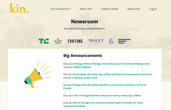
The important thing is to convey the message that your company is alive and well, and that news outlets are writing about it. For example, see the super-sleek news page maintained by homeowners insurance startup Kin (a content marketing client of ours).
2: Include Publication Logos
A news page can help people do in-depth research about your startup, but more likely, visitors will scan it quickly. What do they see when they get there? If time’s short, they better see logos from each publication, right beside the placement. After all, a picture is worth a thousand words.
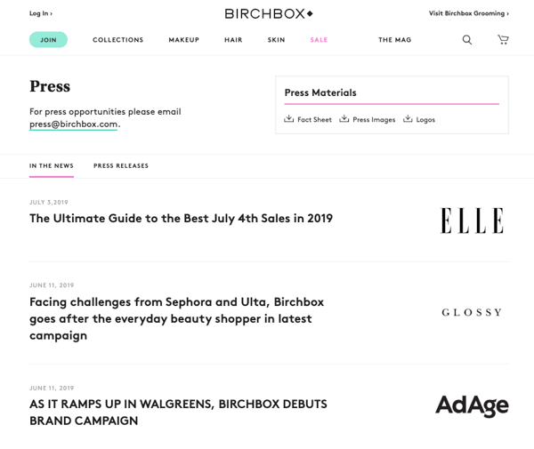
See how beauty subscription company BirchBox does this without letting the various logos clutter the site’s clean, minimalist style.
3: Link to Your Placements
This one seems obvious, but often, news pages don’t link to the article or they just show logos of publications where the startup (supposedly) was featured. But you want to help the intrigued reader dig deeper.
When you link, be sure to make sure you have the links open in a new browser tab to keep your website up on your visitors’ screens. (Never done this before? Most content management systems have a setting that lets you select “open in new tab” or “open in new window,” but if you can’t find that, just add this HTML code to your links.)
4: Include Excerpts of Your Placements
Give the reader a taste of what the placement is all about, with a brief excerpt from the article. This might be a few sentences about your product, the first few sentences of the article, or possibly your own summary of the piece. Regardless of your approach, just keep it consistent and compelling.
Excerpts help communicate to visitors what about your business is buzz-worthy. They’re also a great way to keep visitors on your site – if they can get the gist of your placements from you, they’ll have no need to go elsewhere!
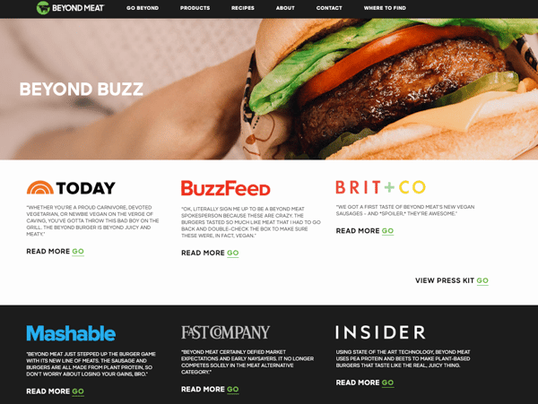
See how Beyond Meat includes excerpts to make its news page as juicy-looking as the picture of the burger in the hero image.
5: Separate Press Releases from Placements
It’s tempting to lump together placements and press releases into a single list of articles, but we recommend keeping them separate. If you don’t yet have sufficient placements, and what you do have looks a bit slight, then go ahead and mix them up. Just do so with an eye on separating them eventually.
6: Highlight Your Biggest Wins
While it makes sense to organize your news page chronologically, there’s no rule that says you can’t highlight your biggest wins at the top.
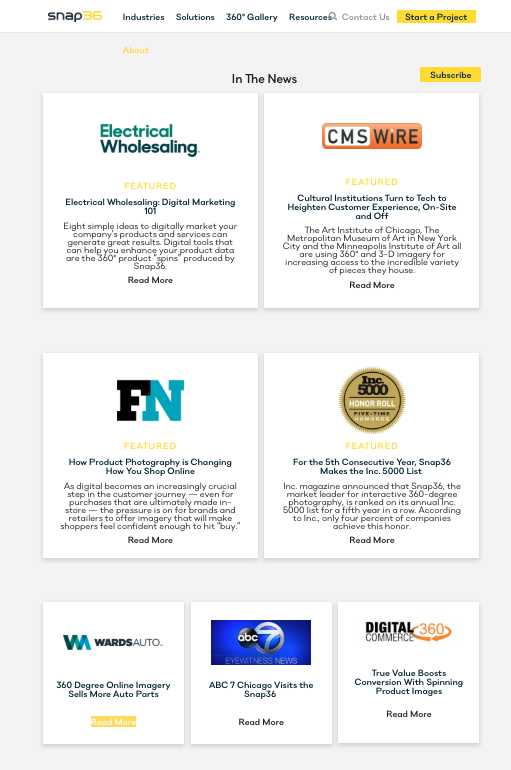
The design of rich content solution Snap36’s news page is one way to tackle this: include a few “featured” stories at the top of the news page, then add the rest chronologically.
7: Keep All Placements on a Single Page
It’s unlikely that you’re going to be dealing with hundreds and hundreds of placements, so why not keep them all on one page? Resist the urge to require clicking through month by month or year by year – make it easy for the reader to see them all.
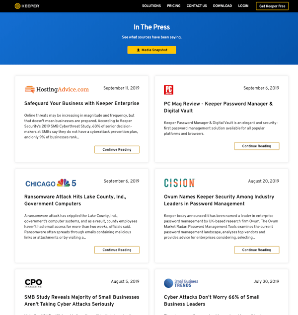
KeeperSecurity handles this well, offering a long, scrollable page. Take a look yourself – it makes quite an impression!
8: Make Sure It’s Responsive
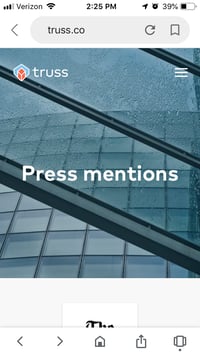
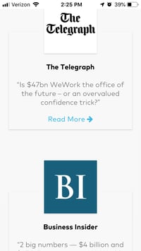
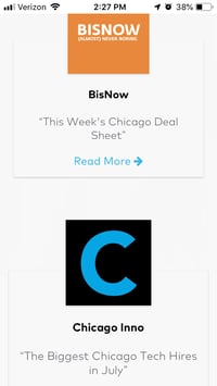
Remember: more than 50 percent of all web traffic is mobile. If your press page doesn't work on a smartphone screen, you’re not communicating well with more than half of your audience. For an example that’s doing this nicely, visit Truss’s news page (or see screenshots below if you’re on a desktop).
9: Include Contact Info for Press Inquiries
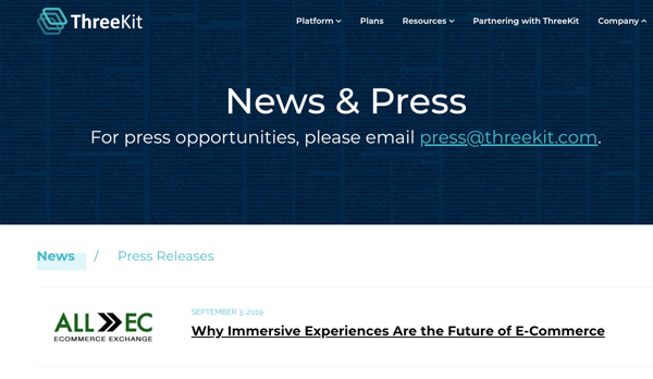
Inbound press inquiries aren’t the norm for most startups. But on the other hand, why make a reporter’s job any harder than it has to be? Make it easy for reporters to get in touch with you to tell your company’s story by including clear instructions for reaching out. ThreeKit’s news page offers a great example.
10: Link to Your News Page in Your Header or Footer
Your news page won’t give you any credibility boost if people can’t get to it. A link in your footer is a low-key way to make sure your press coverage is always easy to find. If news coverage is more central to your brand and what you’re doing, you may also want to include a link in your header. These can most often be found in the “About” section.
11: Update Instantly
As soon as you land a placement, it should get posted on your news page. That means someone on your team should have the job to post media coverage as soon as it goes live. If you have a content management system and a simple design, the process should take no more than five minutes. That’s what we do with our client hits page – it’s actually a fun thing to do!
Your News Page Doesn’t Have to Be Perfect
You’ve probably noticed that not all of our examples follow all of these best practices – and that’s okay. What’s more important than having the perfect news page is having any news page.
And if you’re super excited about getting this page on your site but don’t currently have any media coverage to fill it with, why don't you grab some time with me. We can definitely help.


