
Among writers, it’s fashionable to hate math.
But for writers who become content marketers, math is an inescapable part of the job. That’s because we build arguments based on data. Interpreting and analyzing that data requires – you guessed it – math.
This is a big deal. If we do the math wrong, we end up with inaccurate information.
At best, this costs us credibility. At worst, it could lead our readers to take actions that cost them money, time, and customers (which would, in turn, cost us credibility).
What’s more, we’re in an era where some publishers are deliberately spreading incorrect or misleading information. Publish some faulty analysis, and you risk becoming a favorite source for those bad actors. YIKES!
So what’s a writer who doesn’t love math but makes a living as a content marketer to do?
Take heart. In this post, I’ll explain how to write about numbers accurately, helpfully, and effectively – even if you hate math.
Note: the first two-thirds of this piece turned into kind of a rant. Feel free to hop straight to the how-to section.
The 4 Kinds of Bad Writing About Numbers
In my experience, there are four kinds of bad writing about numbers:
- Bad writing that stems from bad editing or proofreading
- Writing whose meaning isn’t clear
- Writing that includes honest mistakes
- Deliberately misleading writing
Let’s take a look at examples and how to fix them.
1: Bad editing or proofreading
A recent article about pandemic-era CTA ridership from Crain’s Chicago business includes this subheading: “trains and buses are carrying fewer than half the riders as pre-pandemic.”
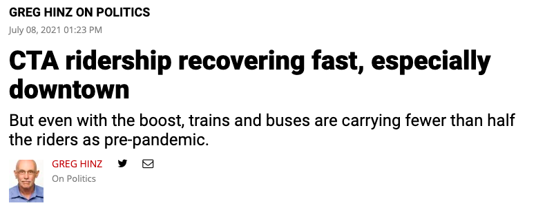 Figure 1: numbers writing without parallel structure
A better rewrite would be “fewer than half the riders they had pre-pandemic” or “fewer than half as many riders as pre-pandemic.”
What’s encouraging about this kind of bad numbers writing is that it doesn’t require any math at all to fix – it just requires proofreading! In this case, it’s a parallel structure issue, which most editors are comfortable fixing.
Here’s another example, from Twitter: “@rustybrick changes his profile pic in nearly a decade!”
Figure 2: lack of proofreading makes for a jolty tweet
Again, a simple proofreading issue: the correct version would be “changes his profile pic for the first time in nearly a decade.”
Both of these examples are pretty straightforward: despite the flubbed sentence structure, we still know what they mean. But in more complex examples, confusing sentence structure can make a bad problem worse.
To prevent this type of bad numbers writing, aim to get a second set of eyes on things before you publish. If that’s not possible, try to give yourself some time away from a piece so you can review it with fresh eyes before pushing it live.
2: Writing with an unclear meaning
Unclear writing happens all the time, whether or not numbers are involved.
The problem with adding numbers to the mix is that the rules of the language become more rigid and so writers have less flexibility.
For example, a well-meaning editor may see a phrase like “$100, less the original amount,” think it’s a typo, change it to “$100 less than the original amount,” and drastically change the meaning of the sentence.
In my experience, a lack of clarity in numbers writing tends to happen for two reasons:
- Writers who are unfamiliar with math use imprecise or incorrect language to report numbers.
- Math people who are inexperienced with writing express their findings inelegantly.
There’s also a third, hybrid reason: writers are interpreting the inelegant writing of math people and perpetuate the lack of clarity rather than try to dig into the original numbers and reframe them – likely because they hate math and don’t want to deal with it.
Let’s look at some examples.
This article from Meaww.com claims that “women-led nations saw 6 times fewer Covid-19 deaths” than those led by men (see Figure 3).
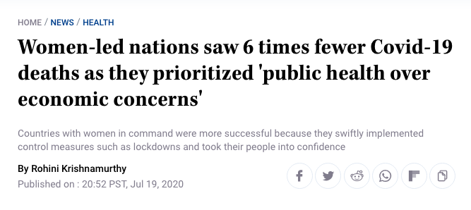 Figure 3: “6 times fewer”
I find this construction baffling. Does “six times fewer” mean the same thing as “one-sixth as many as”? If so, why frame it like this?
I think the confusion comes from the “times fewer” construction. A whole number followed by “times” implies multiplication, which signals something will get bigger. But then “fewer” confuses things.
I did a little digging and found that this headline is an example of the hybrid problem I mentioned above: the original publication (by the math people who did the research) uses the phrase “six times as few,” to which I reply ?!?!?
Tellingly, it also uses the phrase “much fewer deaths,” which told me everything I needed to know: these math people are not writers. If I looked at the original numbers, I could interpret “six times fewer” accurately.
Here’s what I found: at the time the research was conducted…
- Female-led countries saw 1,983 COVID deaths.
- Male-led countries saw 13,276 deaths.
In other words, male-led countries saw about 6.7 times as many deaths as female-led countries, meaning female-led countries had about one-sixth (or one-seventh, depending on whether you round or truncate) as many deaths as male-led countries.
That’s fine, as far as it goes. The awkward phrasing meant what I thought it meant.
But what struck me was that those numbers were gross totals, not per-capita numbers. When we take into account the deaths per capita in male- and female-led countries, the gap tightens: male-led countries had 1.6 times as many deaths per capita as female-led countries.
I don’t want to seem coarse here: I’m making an argument about clear writing and using data about human death.
But that’s actually the point: if you’re reporting on the horrible, unnecessary toll that COVID has had on the world, you don’t want your audience puzzling over the meaning of your language rather than feeling the enormity of what you’re communicating.
And if you’re trying to highlight that certain policies lead to less death and suffering, you’d better be sure you’re reporting data that can’t easily be discounted by people who might do additional analysis and undermine your original point.
Let’s face it: 1.6 times as many deaths doesn’t sound as bad as 6.7 times as many deaths.
And if someone cared to dig in and discount the original article in that way, the writer and publication would look bad. What would get lost would be the reality that there are known steps leaders can take to reduce human death.
A few less-upsetting examples:
- 300 percent growth: Any percent growth over 100 can be confusing. Technically, 300 percent growth means that something is now four times as large as it was at the beginning (the growth = 300 percent of the original). But I’ve seen this to mean that something is now three times as large. For percentages greater than 100, using a multiplier is less confusing (i.e., “300 percent growth” is clearer as “4x as large as”).
- 82% effective against hospitalization: This Vox piece goes into detail about the effectiveness of various COVID vaccines against hospitalization. The problem: while the numbers are clear enough, the article doesn’t explain what “percent effective” means. I dug into the data and couldn’t come up with a satisfying explanation. (If you understand what this means, please let me know and I’ll update this post.) It’s safe to assume that, if your readership is the general public, they may need a primer on what various number-related terms mean.
3: Honest mistakes
I see this one a lot. It manifests as things like reporting growth of four percentage points as four-percent growth.
In my experience, it generally happens when a writer doesn’t understand the relationship between the mathematical concept and the language to express it.
4: Deliberately misleading numbers
This one is nefarious. It may be technically accurate but deeply – and intentionally – misleading.
This Newsweek article is dedicated to one such example: a recent claim by Florida Governor Ron DeSantis that COVID cases were up 300 percent year over year (see Figure 4).
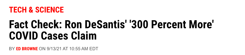 Figure 4: Newsweek fact checks DeSantis
The claim is, technically, true. Two credible sources (including the CDC) report that daily new COVID cases were roughly 300 percent higher on the day DeSantis spoke than they were a year earlier.
The problem is, DeSantis is using the number without context to support objectively harmful actions.
His argument is that the 300 percent increase in new cases is evidence that President Biden’s policies are failing and to push back against a proposed mask mandate.
In reality, of course, the growth in new cases is attributable to both the more-contagious Delta variant now dominant in the US and the utter failure of public officials (including DeSantis) to put regulations in place that would curb the spread of the virus.
As I said, nefarious.
But not new (see Figure 5).
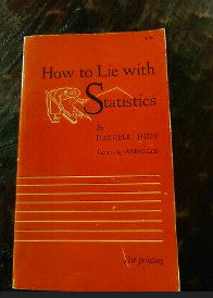 Figure 5: The cover of the 1954 first-edition of Darrel Huff’s How to Lie with Statistics
I promised a how-to here and I’m still popping off about examples. So let’s get into what good numbers writing looks like and how to do it.
What Does Good Writing About Numbers Look Like?
I recently came across this beautiful example of numbers writing in a McKinsey report about financial services (emphases mine):
“Gen Z and Millennials had the most fintech accounts overall. Gen Z saw an increase of 14 percentage points of new users (or a 27 percent increase) and Millennials saw an increase of 8 percentage points (or a 17 percent increase). A substantial number of Baby Boomers – 26 percent – rely on some sort of fintech account, contradicting the general perception that digital tools are exclusively for younger people.”
Why is this so good? Let me count the ways:
- It reports increases as both percentage-point increases and percent increases. This acknowledges that some readers may not be totally sure what percent increase means. It goes out of its way to be super clear and transparent. Smooch!
- It includes a helpful summary!
- It includes helpful context!
- It’s well edited and crystal clear!
This is what we should all strive for: numbers writing that is honest and accurate and makes something easier to understand.
How to Write About Numbers When You Don’t Love Math
So how can you write like McKinsey if you loathe numbers and dread calculations? Here are four strategies:
- Understand your source material. This means referring to the original data whenever possible but also understanding the context of that data. Who gathers it and reports it? How often? What are their methods? What are their motivations? If you can’t find these answers, ask. If you go into a piece unclear about some aspect of the data you’re writing about, you won’t be able to write both clearly and accurately about it. You may also find you have “writer’s block” that isn’t writer’s block at all – it’s your brain acknowledging that you don’t yet understand something well enough to write about it.
- Use online guides and calculators. This isn’t a math test – you can Google whatever you want! For example, here’s a great resource for calculating percent change.
- Draw a picture. Numbers are abstract. It’s okay if you’re struggling to really understand what they mean. And if that’s the case, drawing a picture can help (see Figure 6).
- Write simply. “Increased by” and “decreased by” are fine. Prefer simple (not compound) sentences. The fancy footwork can come in the analysis.
- Practice. Not a quick fix, I know, but practicing is key to getting better at anything. If you're uncomfortable writing about numbers today, that’s fine! But if you want to feel more comfortable, you’ll have to do it more.
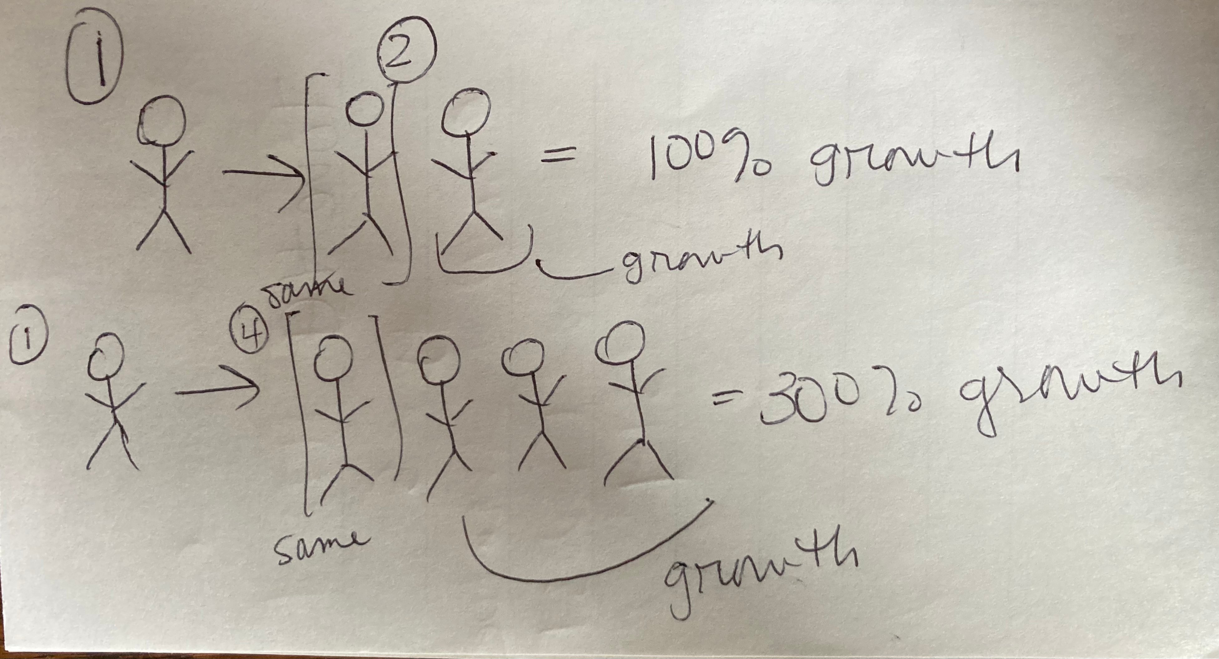 Figure 6: A picture to help my brain process 300% growth
Translating Numbers to Words Matters
When I started writing this piece, I didn’t expect it to rile me up as much as it did. But here’s the situation: we are in a reality where lots of people are deliberately manipulating data and reporting numbers in bad faith for their political and financial gain.
We content marketers may not think our contribution to the online conversation matters much one way or the other. But it does. You never know when a piece you publish could go viral or even become the highest-traffic page on your website for reasons you don’t understand.
Or, heck, maybe your miscalculation only goes as far as your company’s social media and the intern running the account gets chewed out by the CEO when they see the mistake. Is that really something you want on your conscience?
I hope not, reader.
And if you read this and you still feel like you don’t want to touch numbers with a 40-foot pole, well, get in touch. We can certainly help.


